- Brand Identity
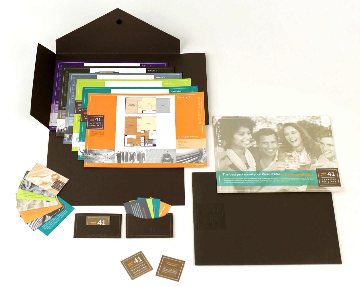
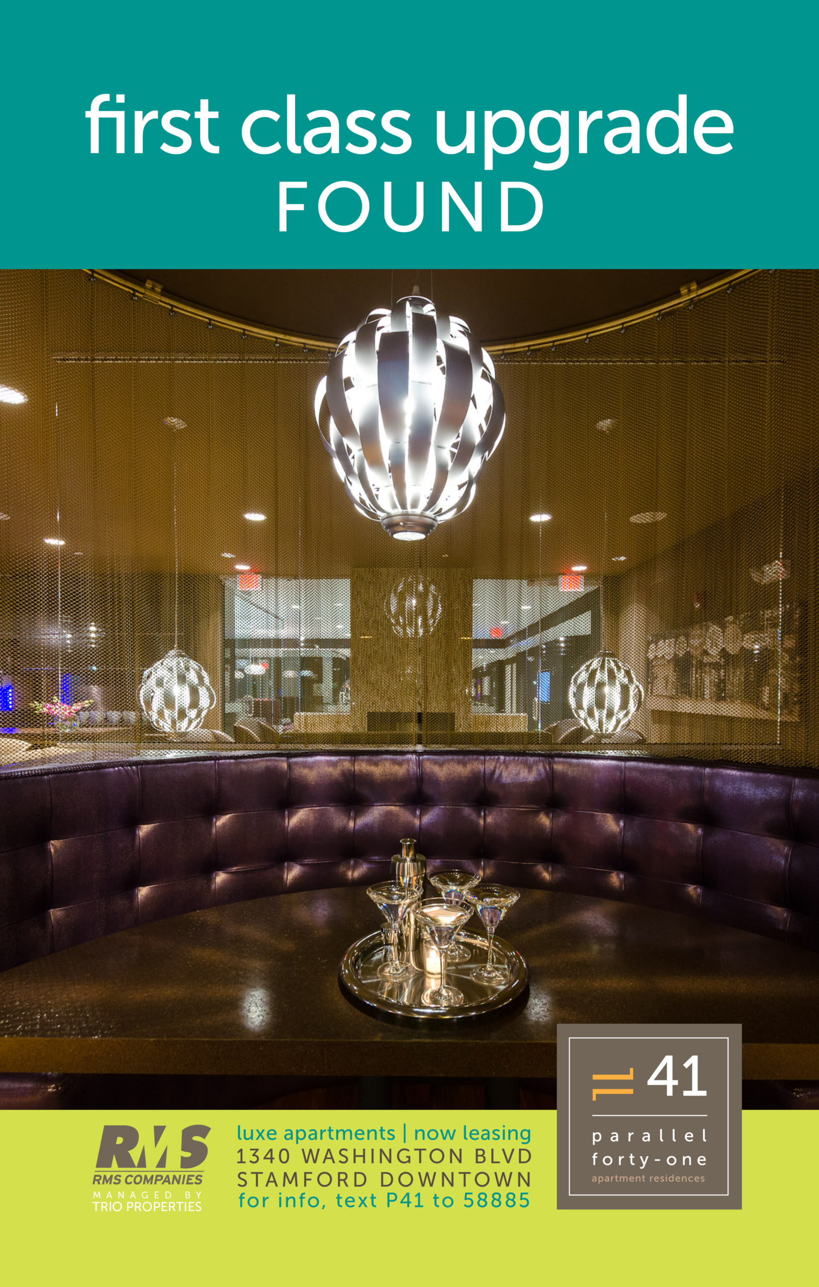
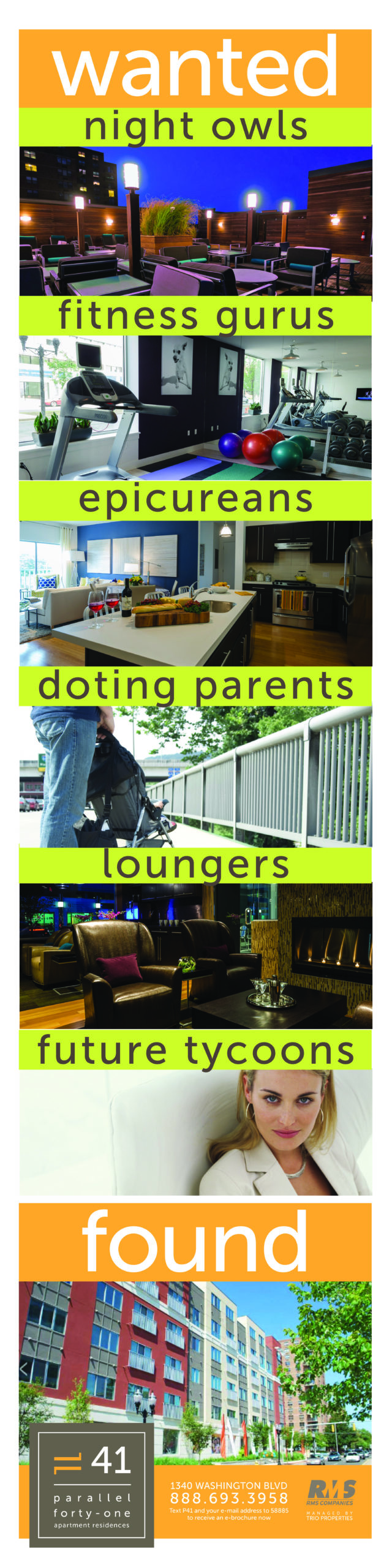
Parallel 41 Apartment Homes
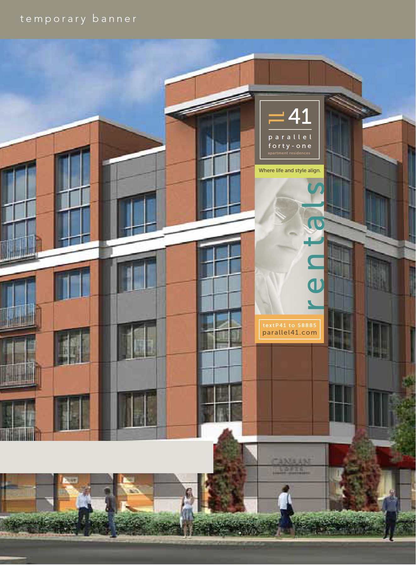
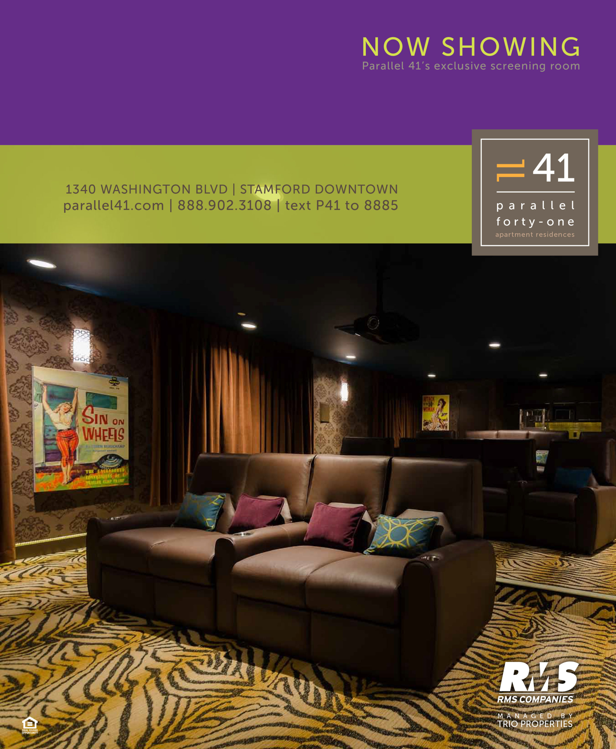
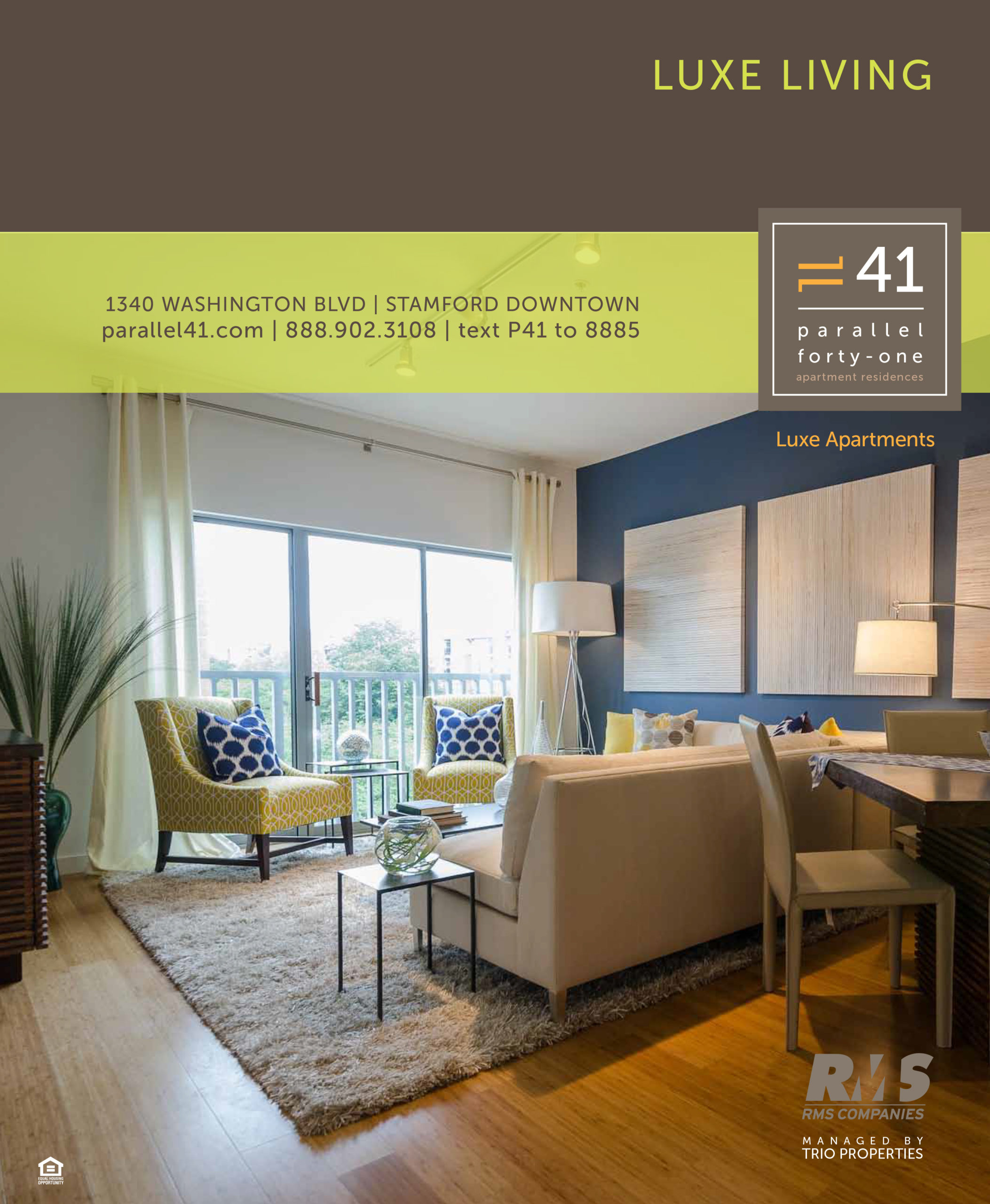
Parallel 41 Apartments in Stamford, CT was named after its latitudinal position, and it appealed to those who sought a high-end lifestyle—jet-setters, foodies, business leaders. With luxury amenities and lifestyle offerings, Parallel 41 was positioned perfectly to appeal to the urban lifestyle and the messaging highlighted that this is the ultimate luxury destination where you can find everything you want.
Aspirational and bold, the advertising took the form of full-window decals, rail signage, banners, newspaper wraps, and more. The print collateral was distinctive, using heavily textured papers and bold colors. A large folder opened to reveal colorful floor plans, and the key highlights were described on the back of business card-sized photos, which fit into a unique paper wallet. Building signage and business cards were square, and the logo shape was the foundation for the design of all the pieces.
Writing by Sharon Rapoport. Marketing strategy by Brio Consulting.