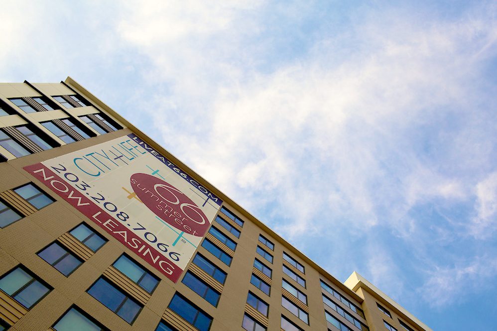
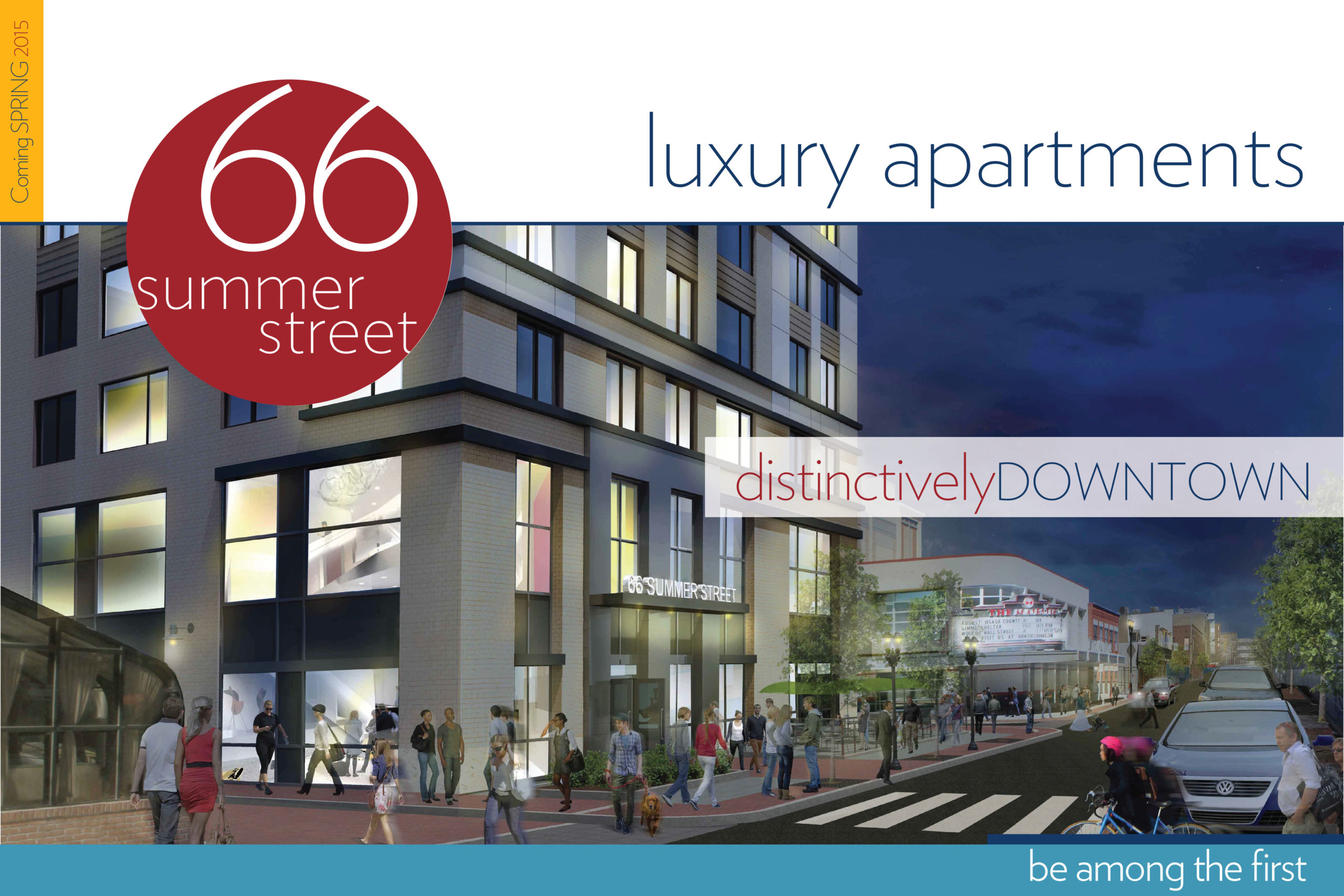
66 Summer Street
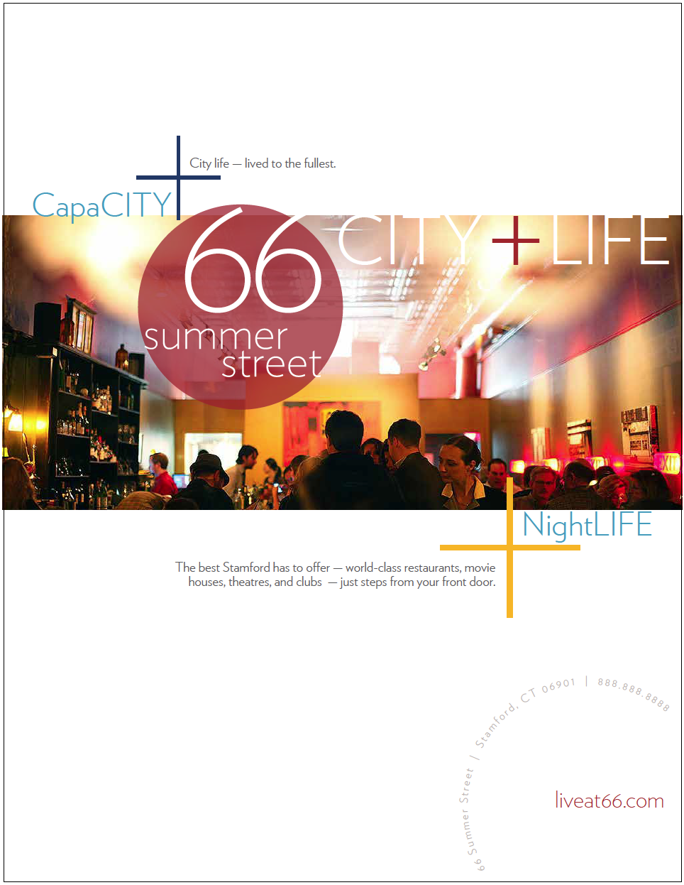
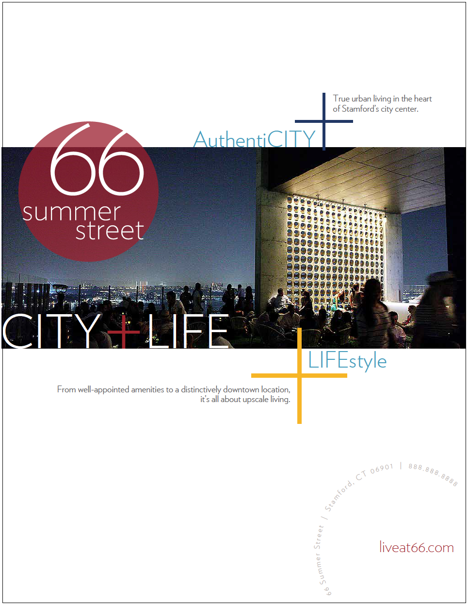
If you take everything that’s appealing about living in downtown Stamford, CT—proximity, convenience, the vibrancy of an urban location—and combine it with everything that’s attractive about upscale apartment living—amenities, comfort, aesthetics—what you get is 66 Summer Street.
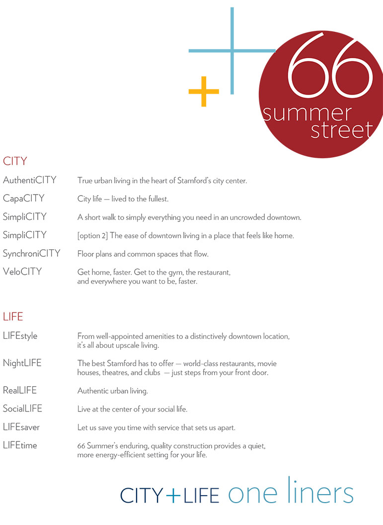
Our imagery addresses one question: what does it truly mean to be at the center of things? Predominant visuals include lifestyle images, symbols, icons, and textures drawn from our location, the surrounding destinations, and our interiors. Think photos of downtown cityscapes. Objects representing proximity to water, mountains, city, train. Typewriter keys and textures from our interiors. Maps. It’s all about illustrating the huge array of benefits to living here, while visually representing the idea of city plus life. A place where all of these features add up to be more than just the sum of its parts.
Deconstructed words will come together in an unusual and captivating way to create a unique portrait of CITY + LIFE.
Writing: Sharon Rapoport
Marketing: Brio Consulting